Visualising Covid-19 data

Covid-19 as you will know has gripped the whole world. It has been classified as a pandemic by the WHO. I am no expert on the disease itself and do not have any expertise on policy making, it would be unwise for me to comment on the actions taken by all the different governments from around the world.

My interest in this is very academic and data driven. The numbers which are changing daily are used to chart the progress of the disease as well as study the impact of the various measures taken to counteract the spread of the virus.

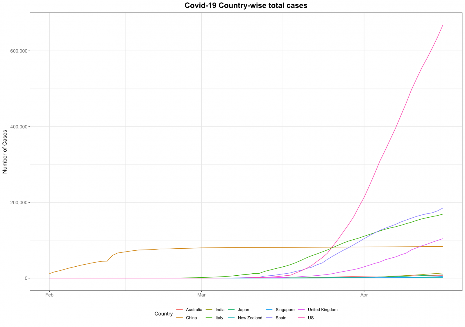
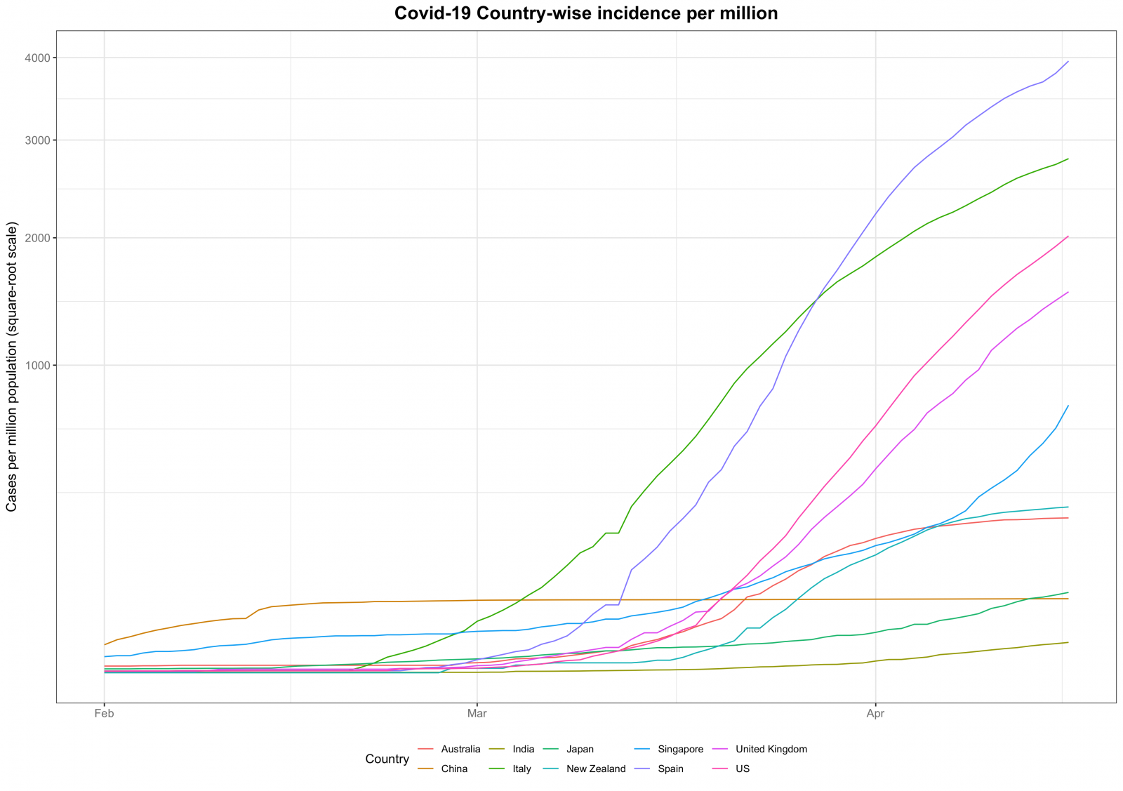
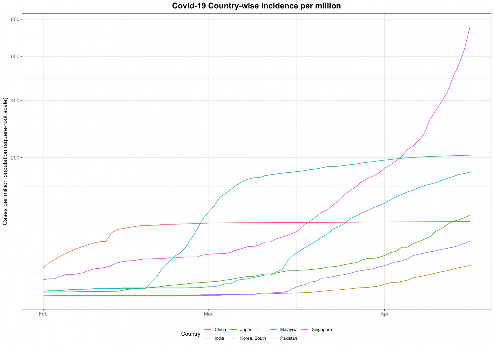
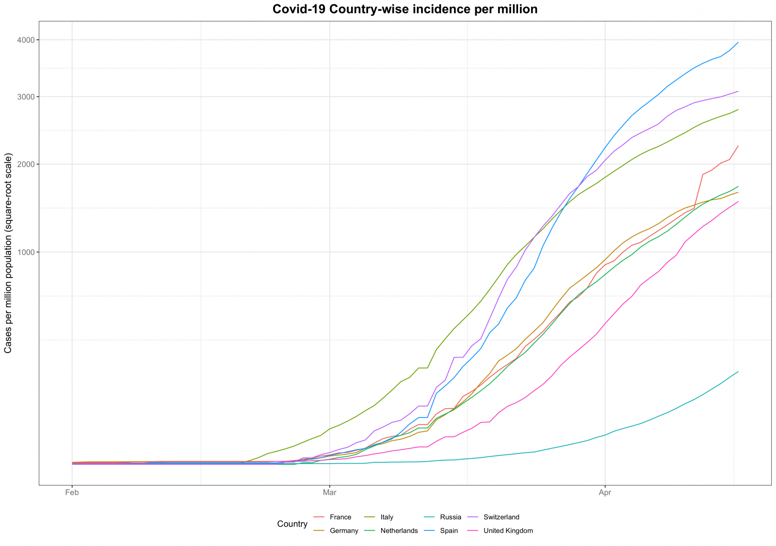
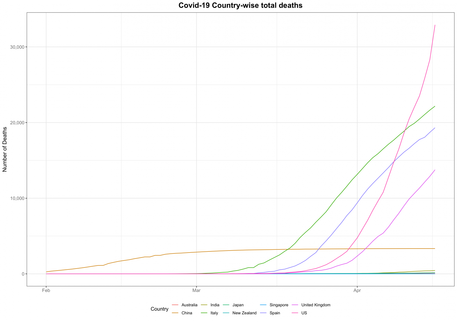
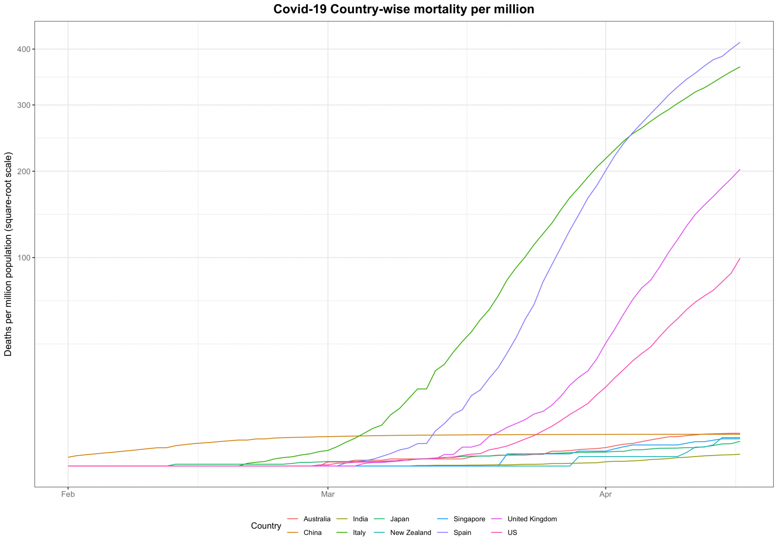
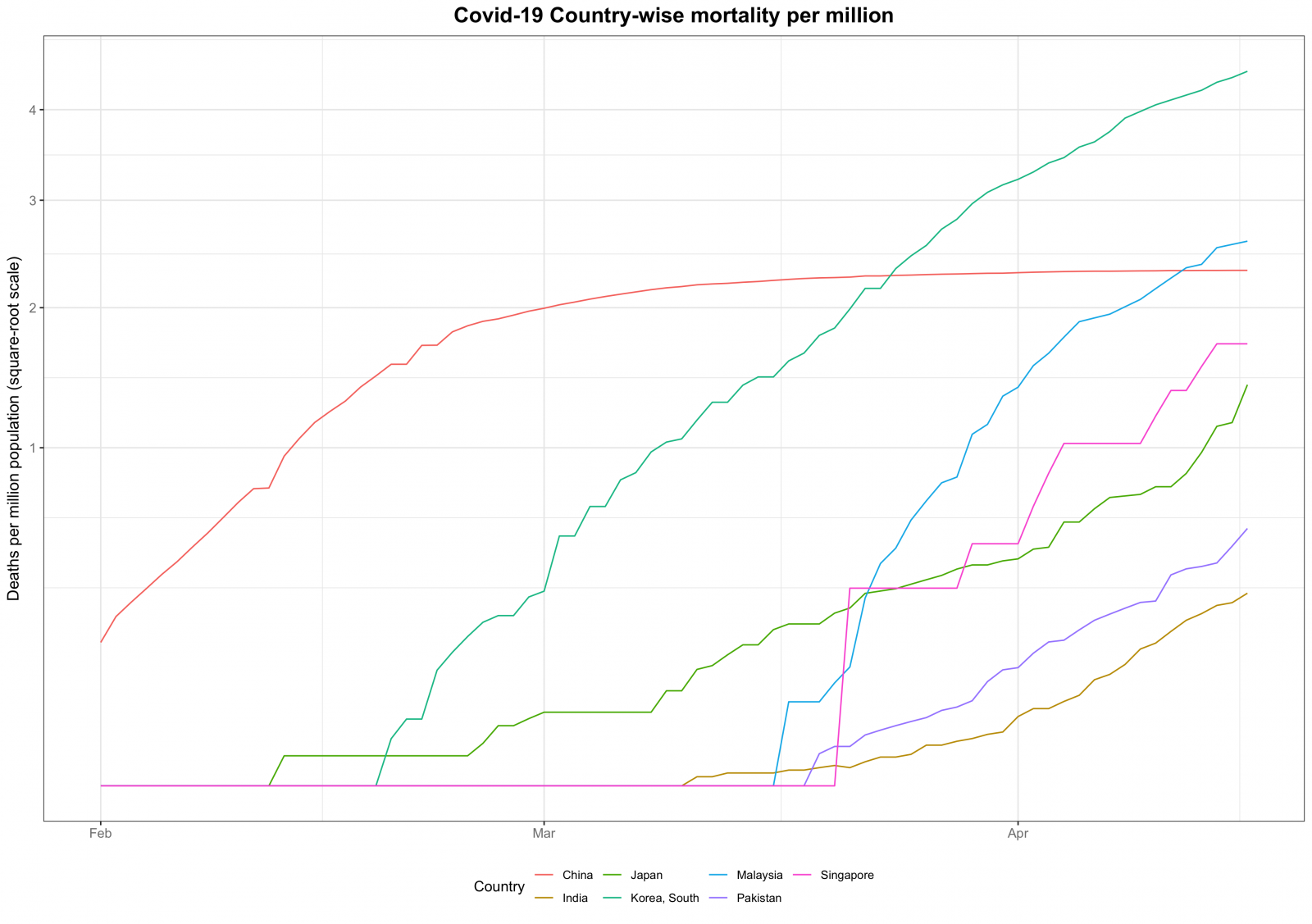
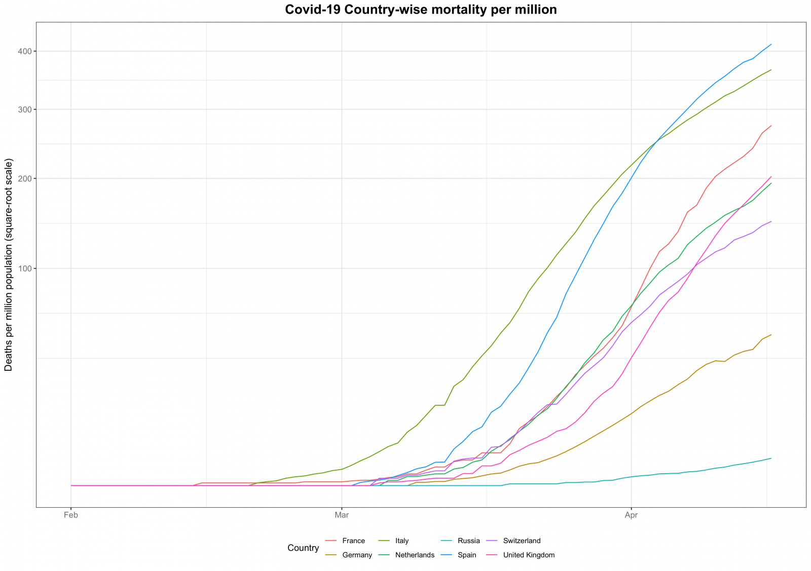
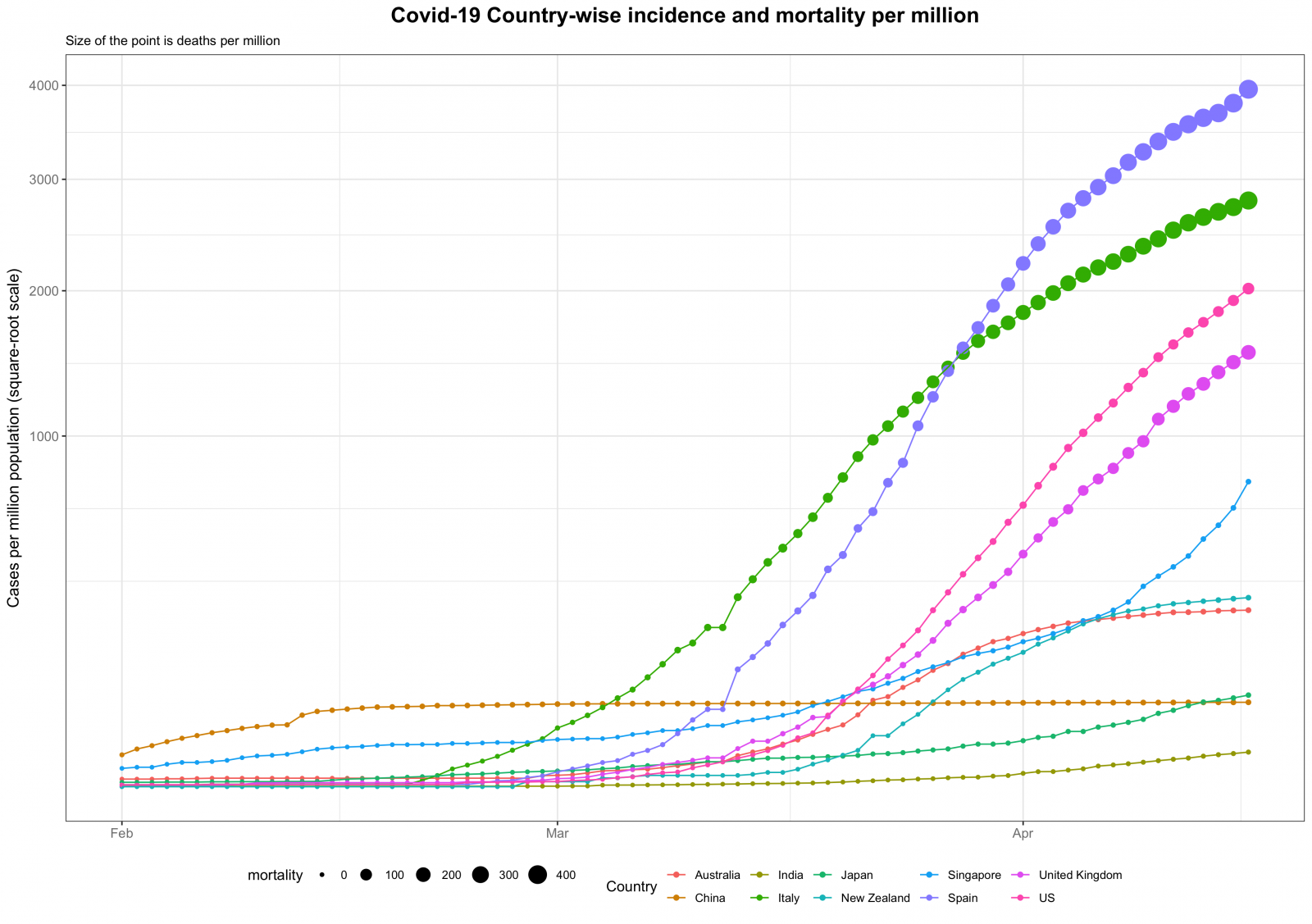
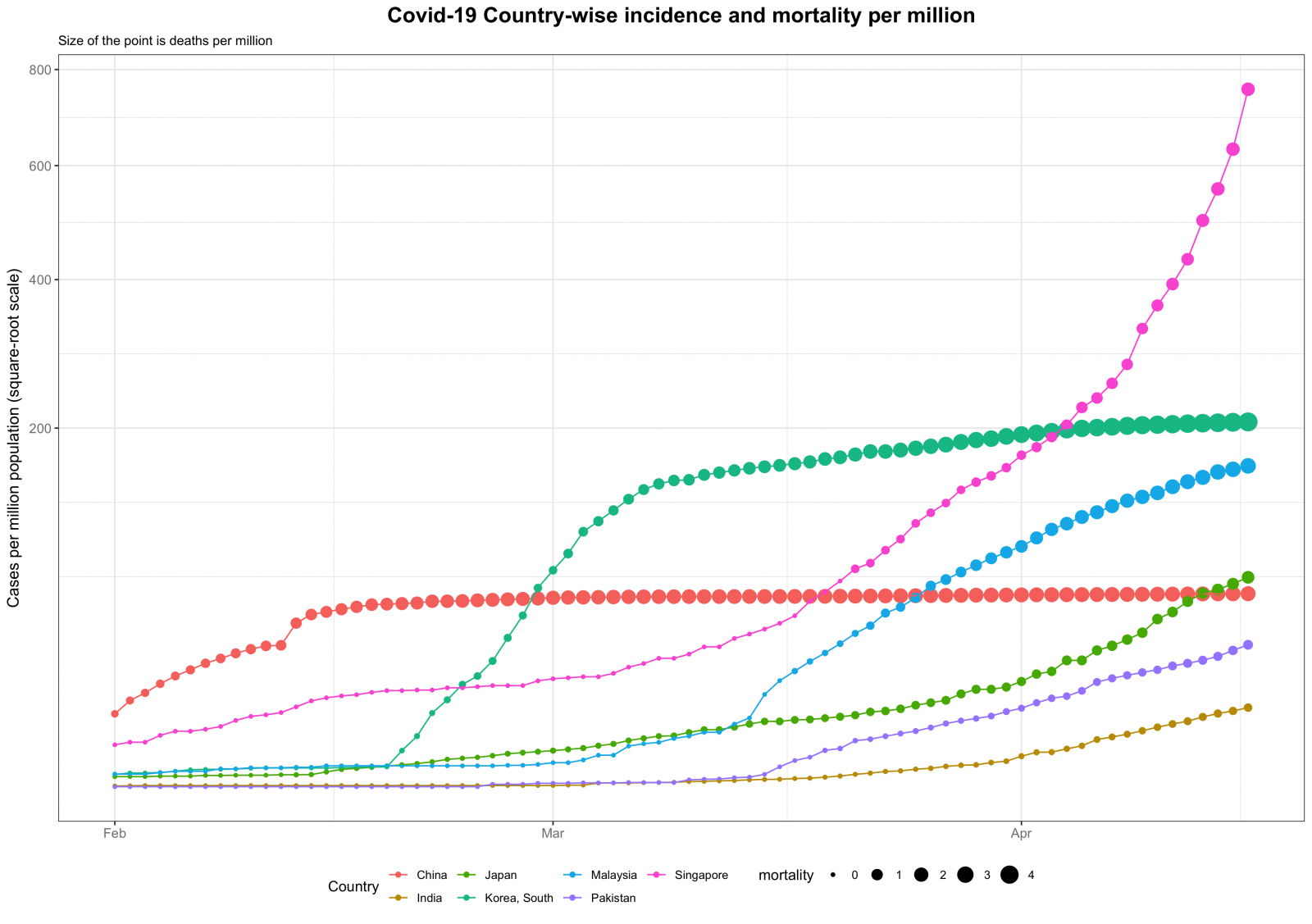
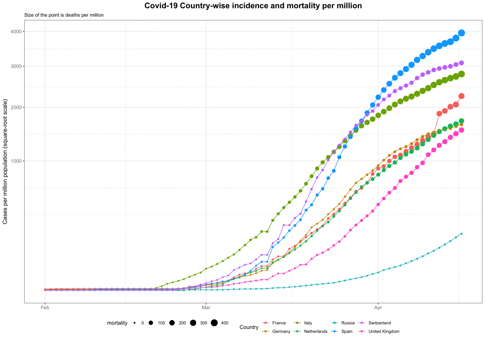
Over the past few weeks, a lot of data has been used to produce graphics which can communicate effectively the information pertaining to this pandemic. Of most relevance I think are the number of confirmed cases and the deaths due to coronavirus stratified by country. Most of these graphics have focused on the raw numbers. Although the raw number is useful it nonetheless is incomplete. I think a better measure is to adjust the raw number by the population of the country. This provides a better measure as to how severe the effect of the virus has been on a country.

Keeping that in mind I produced some graphs for population-adjusted confirmed cases and deaths for some select countries. I plan to update these graphs on a regular basis over the coming weeks to understand the spread of this disease. All plots start on 1 February 2020 and end on the latest date for which I have the data. All data has been sourced from the Johns Hopkins University Center for Systems Science and Engineering (JHU CSSE)a.

Further subdividing the population into gender and age subgroups can provide more nuanced information. A good source for such informative graphics and the related analysisb can be found here.

References

a JHU CSSE Covid-19 Github Data Repository: link
b Max Roser, Hannah Ritchie, Esteban Ortiz-Ospina and Joe Hasell (2020) – “Coronavirus Disease (COVID-19) – Statistics and Research”. Published online at OurWorldInData.org. Retrieved from: ‘https://ourworldindata.org/coronavirus’ [Online Resource]

Visualising data

Data visualisation is an essential tool for a statistician or for that matter, any individual user of statistics. It is used to visualise the data being analysed before more rigorous analysis techniques are applied. Or, once the analysis is complete, it can be used as a medium of relaying the results. Visual aids are quite powerful in not only communicating information but also teasing out details from the data.

I learnt a lot regarding good graphics from one of my favourite lecturers at ANU. Another great source for understanding the power of graphics was the many books written and published by Edward Tufte. Anyone in the field of data visualisation would have heard of Tufte. His 1983 book, The Visual Display of Quantitative Information, which has now been reprinted so many times has been a most invaluable source for my learning.

A good graphic will portray relevant information and be self-explanatory. If you feel that you need to provide too much explanation for your graphic, then you might need to reconsider the graphic you have chosen. I think that it is always better to have a simple graph. It is tempting to make an elaborate looking graph which may even be complicated to produce but more often than not, fails to communicate the information.

If you are ever thinking of producing a picture to portray information then I suggest you follow Tufte’s principles of graphical excellence and integrity as outlined in his book mentioned above. To begin with, what a graphical display should do:

  1. Show the data.
  2. The viewer should be able to make inference regarding the data.
  3. Avoid distorting the data.
  4. Make comparisons of different pieces of data easy.
  5. Reveal several levels of detail.
  6. Serve a reasonably clear purpose: description, exploration, tabulation, or decoration.
  7. Be closely integrated with the statistical and verbal descriptions of a data set.

Tufte’s Principles of Graphical Excellence

  • Graphical excellence is the well-designed presentation of interesting data—a matter of substance, of statistics, and of design.
  • Graphical excellence consists of complex ideas communicated with clarity, precision and efficiency.
  • Graphical excellence is that which gives to the viewer the greatest number of ideas in the shortest time with the least ink in the smallest space.
  • Graphical excellence is nearly always multivariate.
  • And graphical excellence requires telling the truth.

Principles of Graphical Integrity

  • The representation of numbers as physically measured on the surface of the graphic itself should be directly proportional to the numerical quantities represented.
  • Clear, detailed and thorough labelling should be used to defeat graphical distortion and ambiguity. Write out explanations of the data on the graphic itself. Label important events in the data.
  • Show data variation, not design variation.
  • In time-series displays of money, deflated and standardized units of monetary measurement are nearly always better than nominal units.
  • The number of information-carrying (variable) dimensions depicted should not exceed the number of dimensions in the data.
  • Graphics must not quote data out of context.
  • Be aware of the Lie Factor, which is a ratio: (Size of the effect shown in graphic)/(size of the effect in data)